- 首页
- International
- 艾特奖
- 文化节
- 服务体系
-
网站导航

The concept was originated from the logo elements we tried to create a new image for the company deriving from their logo. Therefore, first it was essential to apply the color – orange, second was the aim of giving a sensation of flow from the general space through the small details.
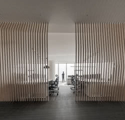
In the lobby area the arrows of the logo start as a catwalk then become reception and ends in a lower ceiling. The rooms are characterized by round shaped angles, which are also connected to the lobby flow of arrows. The walls seem to float ending with curves, which again implies the arrow concept. All this provides a feeling of a constant flow.
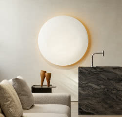
The predominant color as mentioned is orange representing the company logo, while the lightness and transparency enhanced by the smoked glass is connected again to the flow sensation. The suspended baseboard and walls that don’t touch the floor provides this lightness feeling as well. By using all these elements the designers wanted to give a more designed image to industrial machine manufacturer offices.

办公 艺术空间 人文关怀
办公 线条美 人文关怀
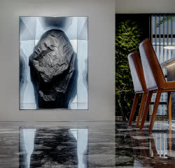
重磅新作 | 巨石总部办公室,设计是对创意、对人、对自然的尊重
设计
办公室设计 数字广西集团 太合南方设计
办公室 多功能